
← Mobile App Development
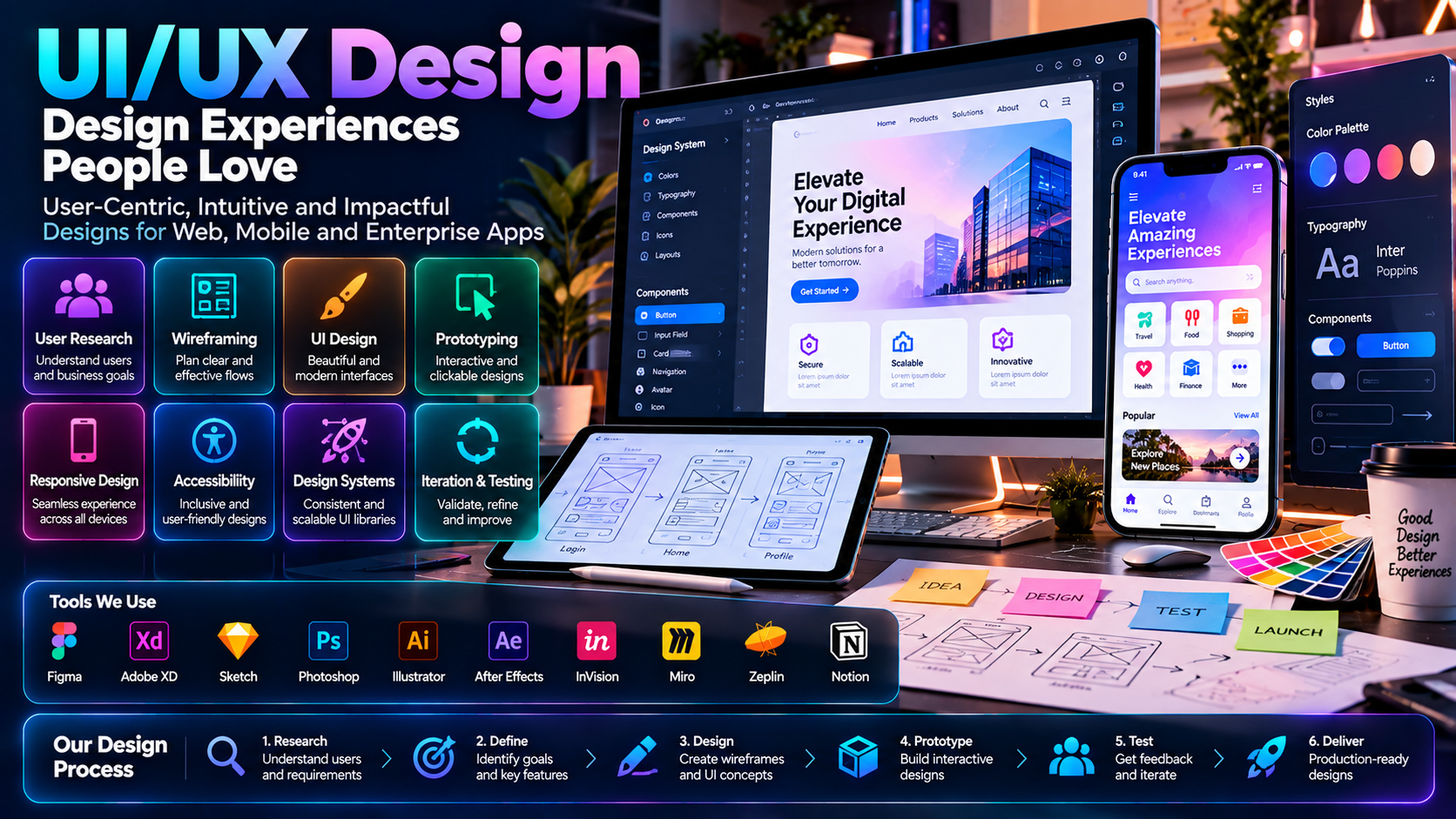
UI/UX Design
An app that looks good but confuses people isn't finished. We design for clarity first — so the first-time user doesn't need a tutorial.
01
User Flow Mapping
Every screen exists for a reason — we map the actual path a user takes before designing a single screen.
02
Clarity Over Decoration
Interfaces built around what people need to do, not visual flourishes that get in the way.
03
Consistent Design System
Buttons, colors and spacing stay consistent across the app, so nothing feels bolted on.
04
Tested With Real Users
Designs reviewed against how people actually tap and scroll, not just how they look in a mockup.